Chelsea 5th Stand App

Connecting a global fanbase to their club and community.

Need

Chelsea FC, one of the winningest Premier League clubs, also has one of the most passionate fanbases globally. Recognizing their digital properties did not match the engagement and passion of the on-pitch action, the club sought to double their engagement — and grow fanbase. 

My Role

  • Design System,
  • UX Interviews,
  • Product discovery,
  • Product strategy,
  • End-to-end oversight,
  • Prototyping,
  • Usability testing

TLDR; Solution

True Partners in Success.
To truly understand Chelsea’s global fanbase, I worked closely with their stakeholders. Numerous strategic sessions, executive interviews, and data-driven research shaped 5th Stand app.

Fan Wish Fulfillment.
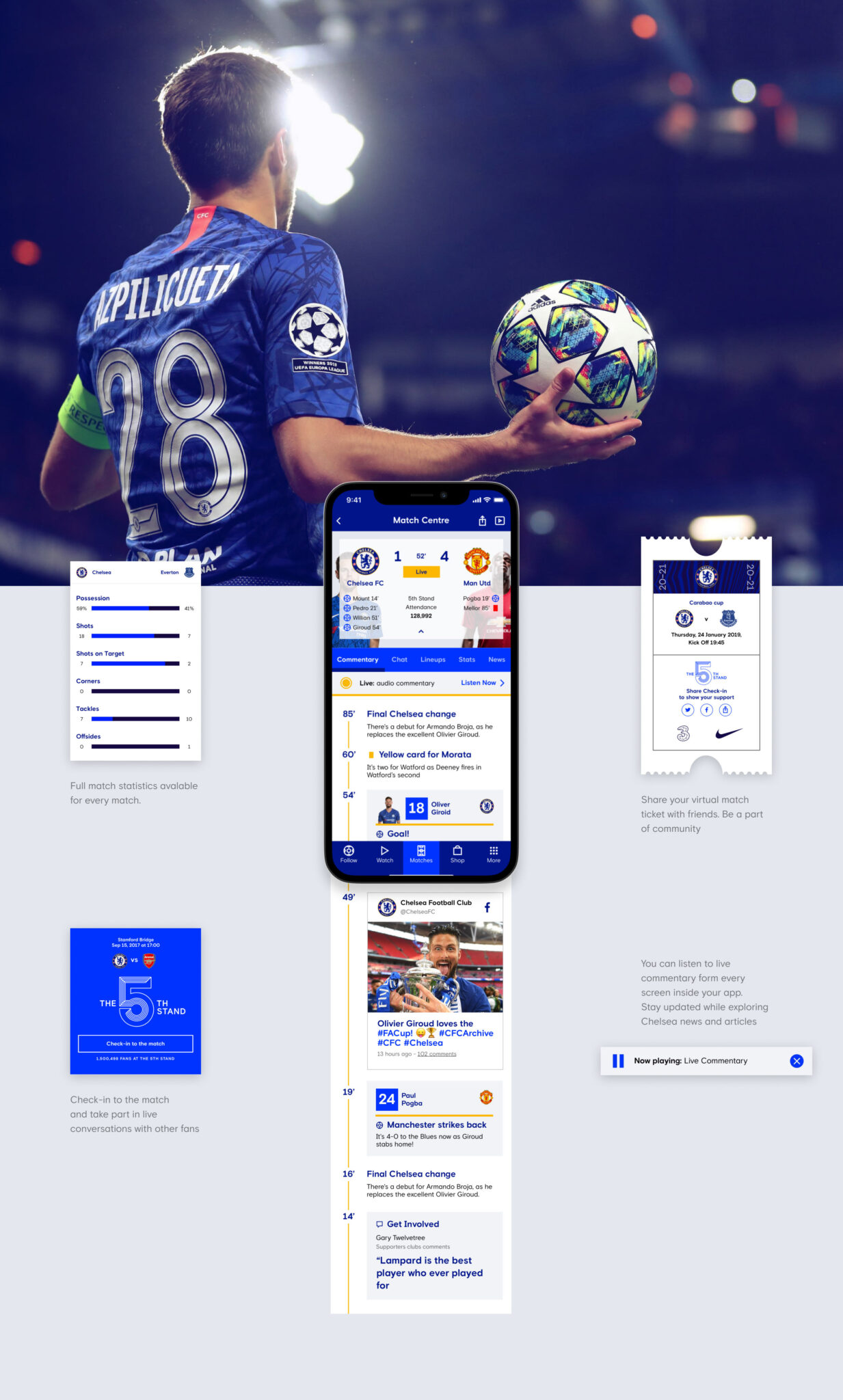
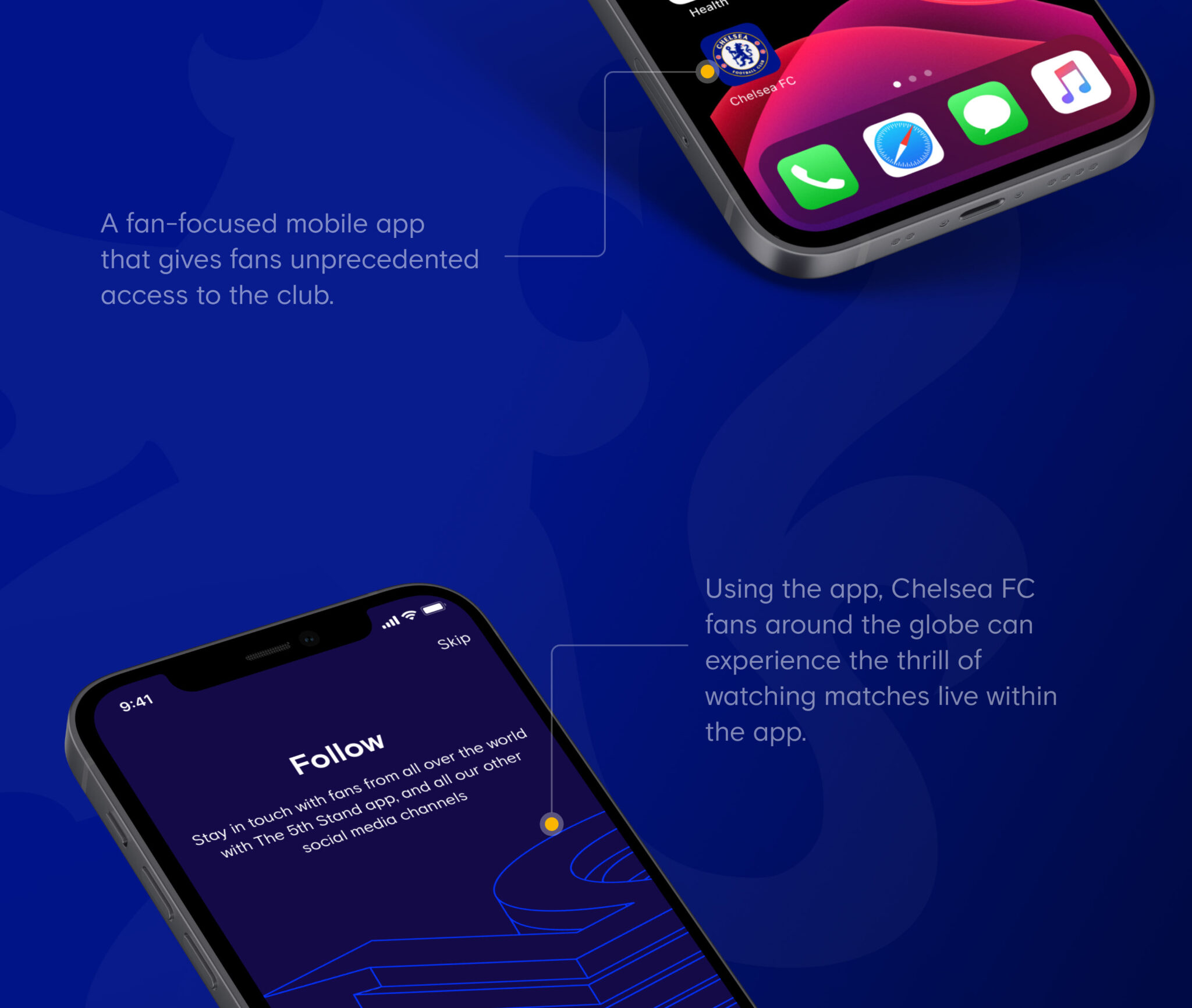
Aggregated fan feedback through extensive research which was synthesized into the product designs. These designs, tested via prototyping, usability testing resulted in the launch of the club’s 5th Stand app. This fan-focused mobile app, which gives fans both local and global unprecedented access to the club, has quickly become one of the most downloaded sports apps globally.

A Deeper Fan Engagement.
In addition to the global and local fan community features, the Chelsea FC 5th Stand app enables fans to check-in to a match, virtually support the club and interact with other fans worldwide.

Design Process

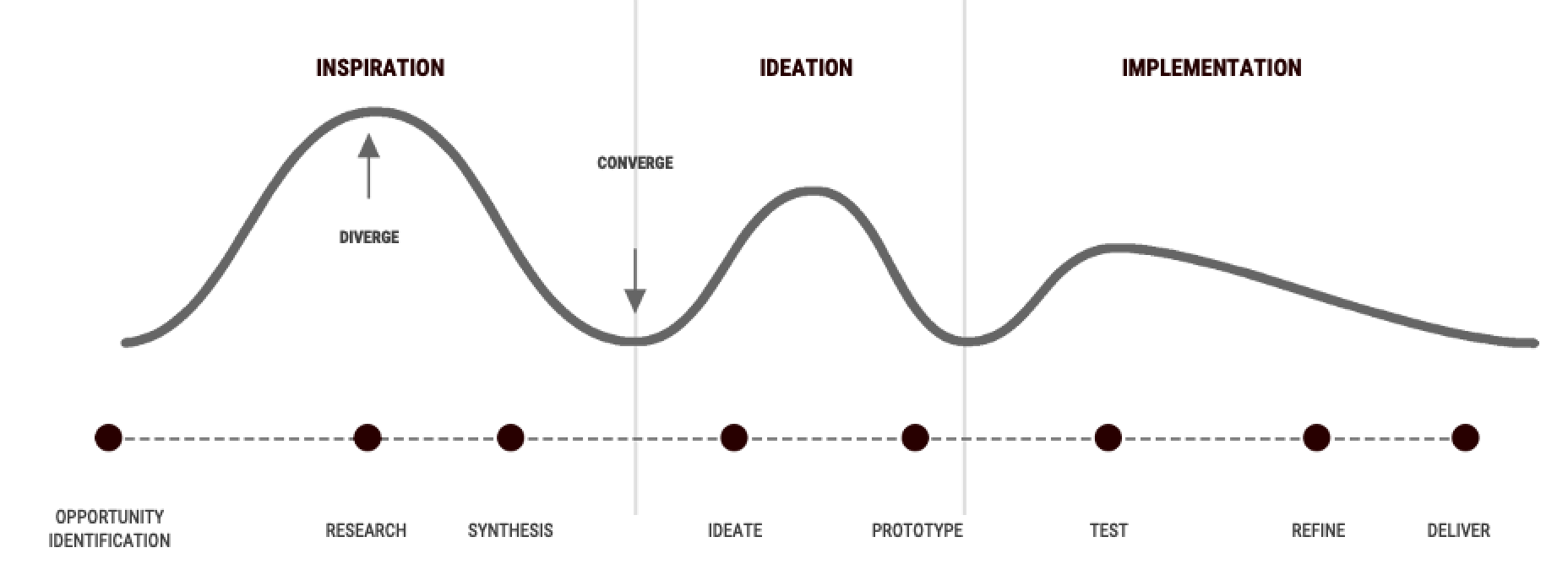
Employed Human Centered design approach to tackle this problem.

Product Discovery

Before beginning the component design, I organized discovery meetings with client and product partners to bring together design decisions. I facilitated internal meetings to identify and prioritize formative product enhancement ideas & features that will be presented to the CFC leadership team for consideration. This included output from workshop, a scoring of ideas against potential, impact and effort matrix. During generative research I covered different segments like Interactions, Objects, speaking with Chelsea fans. 

Research included:

  •  Audience Analysis
  • Market Analysis
  • Competitor Analysis
  • Key Takeaways
After initial research, user, stakeholder interviews and looking at KPI metrics provided by CFC, following things were cleared:

Core Needs:

  • Where is Chelsea ? (Premier, Champions, FA cup)
  • How did Chelsea do in their last match?
  • Who do they play next? 
  • Who scored, where can I see it? 
  • How many points ahead / behind are they?

Frustrations:

  • I want to take part in the match day experience
  • Chelsea should give me unique content
  • No reason to go to Chelsea’s website on a daily basis
  • Memberships and logins make no sense

Motivations:

  • Plays football themselves
  • Interested in every aspect of the game / sport 
  • Follow football gives him aspiration in his everyday life 
  • Fan by choice Identification and personal pride

Goals:

  • Would like to feel closer to Chelsea and the community
  • Socialize with other Chelsea fans
  • Find information about his favourite player
  • Watch videos from the previous match

Ideation

For Ideation stage I worked with CFC stakeholders to brainstorm and ideate ideas together. The process was made super productive by conducting design thinking inspired workshop which included my team and CFCs.

For Ideation stage I worked with CFC stakeholders to brainstorm and ideate ideas together. The process was made super productive by conducting design thinking inspired workshop which included my team and CFCs.

For workshop ideation process I divided task in 3 steps for better clarity and increased participation.

Step 1: Identified Key stages

We identified the key stages that the customer passes through in their interaction with your company. 1. Preparing to attend
2. Travel to Stadium
3. Arrival
4. During Match
5. After Match

Step 2: Decided on the things we want to know

Asked questions like “What do you want to know about each of the key stages in their interaction. What tasks does the user want to complete at a particular stage in the journey? What questions does the user have at that stage?” 

How does the user interact with the organization at this point in the journey? Devices? What is the user feeling at this stage in the process, and how does the organization let this user down at this stage? What could be improved?

Step 3: Divide and Conquer

In groups of two we worked through our exercises.

After Ideation, team created basic User journey to help understand the user better. Then proceeded with IA and card sorting sorting activity. This helped in prioritization of content.

The Ideation workshop gave clear purpose statement – 

“Create a world class digital experience for Club Chelsea members (and guests), to enhance overall hospitality experience, increase bookings, and to create additional commercial opportunities”. 

Design Principles

Emotion Driven:

We lead with emotion in both the way we present the experience and the way we tell stories with the content & data.

Habit Forming:

Through behavioural design principles, aim was to create a habit forming experience that fits into the daily lives of fans.

Mobile First:

Our mobile-first methodology ensured that digital experience is designed from ground up fitting smallest yet personal form factor.

I created certain UX artifacts like User Journey map, User personas then we did card sorting for IA. Followed by iterative  wireframing method to improve designs and usability based on feedback.  Once the design reached to a solid state in Lo-fi mode, developers were brought in to provide their feedback on feasibility. I later worked on high-fidelity prototypes and contributed in design system.
Design team used Zeplin for handing over assets to developers.

I created certain UX artifacts like User Journey map, User personas then we did card sorting for IA. Followed by iterative wireframing method to improve designs and usability based on feedback.  Divided wireframing task between designers based on the user flows and to ensure consistency, we created components first before starting wireframing.  After designers finished assigned user flows, we reviewed all the screens from each user flow and helped each other by critiquing and suggesting better ideas to make sure that we are producing the best quality we can make.

Once the design reached to a solid state in Lo-fi mode, developers were brought in to provide their feedback on feasibility. I later worked on high-fidelity prototypes.

Typography

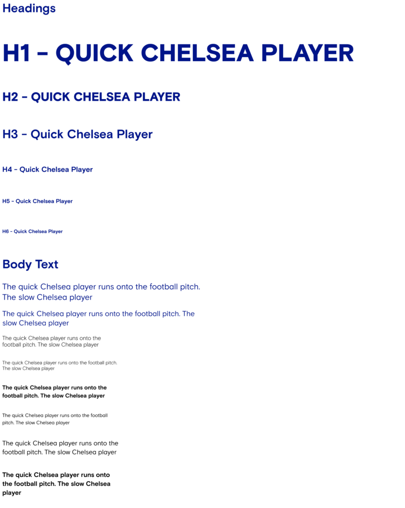
Clear and well-considered typography is at the basis of high quality user interfaces. Our aim was to design highly legible screens, that are easy to scan and read. Decision was made and I documented do’s and don’t around the use of typography across various platforms. 

Once the design reached to a solid state in Lo-fi mode, developers were brought in to provide their feedback on feasibility. I later worked on high-fidelity prototypes.


Updated the design system to use Basis Grotesque and Chelsea Basis across the entire product. Basis Grotesque is designed for digital screens, to maintain optimal legibility across sizes and pixel densities and offers a clean, light, and open aesthetic.

Chelsea Basis is crisp and aligns with Chelseas digital first approach. Both these fonts are great combination and offers clear visual differentiation making it easy on eyes while reading long articles. 

Font Stack:

When Basis Grotesque and Chelsea Basis is not available, the CSS font stack should fall back to the system’s default sans serif font, translating into:

  • Mac OS X (El Capitan+): San Francisco
  • Mac OS X (Yosemite): Helvetica Neue
  • Mac Os X (Mavericks): Lucida Grande
  • Windows (Vista+): Segoe UI
  • Windows (XP): Tahoma
  • Ubuntu: Ubuntu
  • Android (4.0+): Roboto
  • Android (1.5–3.2.6): Droid Sans

Type Ramp:

  • The type ramp is based on the usage of each style available. 

  • It includes a small set of styles that can be used in a variety of combinations to provide clear hierarchy without overwhelming screen with many different font sizes and weights.
  • Do: Use existing styles to define hierarchy between text blocks with different meaning and importance.

    Don’t: Create new styles, or variations of existing styles.

Design System

I redesigned the component library using atomic design principles. We kept the same branding colours. Also communicated with developers to integrate Storybook with Figma. Storybook helps keep Figma libraries true-to-code in a single click, making it effective and productive for our design team to expand components in future whilst making developers life easier. 

Prototype
This illustrates how a user navigates through Play Predictor section in the app. It shows how someone can view upcoming game, submit their predictions, view results, earn points, check leaderboard, read rules.

Design team used Zeplin for handing over assets to developers.

Outcome

Since the launch of the app, the club’s reach and engagement metrics have increased significantly. We remain engaged with the club on several initiatives as we work to identify additional engagement and commercialization opportunities.

Lift:
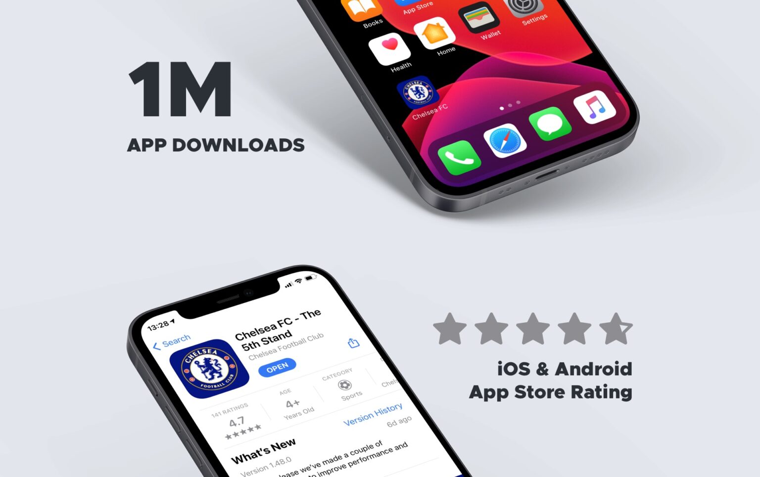
1M+ Downloads,  4.8 star ratings, 74% increased  content consumption through the app.

Don’t Miss 

Check out Chelsea Football Club (CFC) Kiosk Project as well

Process

Stake holder Interviews –

I was solely responsible for User experience and user Interface Design and led all the design process, conducting various rounds of qualitative and quantitative research and creating sketches, wireframes, mockups, and prototypes, while collaborating closely with the developers to ensure the quality of implementation.


Execute the Roadmap

Continue to deliver quality digital experiences across the NFL, NBA, NHL, F1, and Utah.

Portfolio

See some work I’ve done explaining my thought process.

Behance

Check out my work on Behance.net